Texture
Texture is a UI toolkit I’ve been building in Figma. It tries to bring a bit of tactility back into interfaces. Every component looks as if it was drawn by hand: outlines wobble, fills have rough edges, and a layer of paper grain sits over everything. The kit is free, and you can get it from the Figma Community.
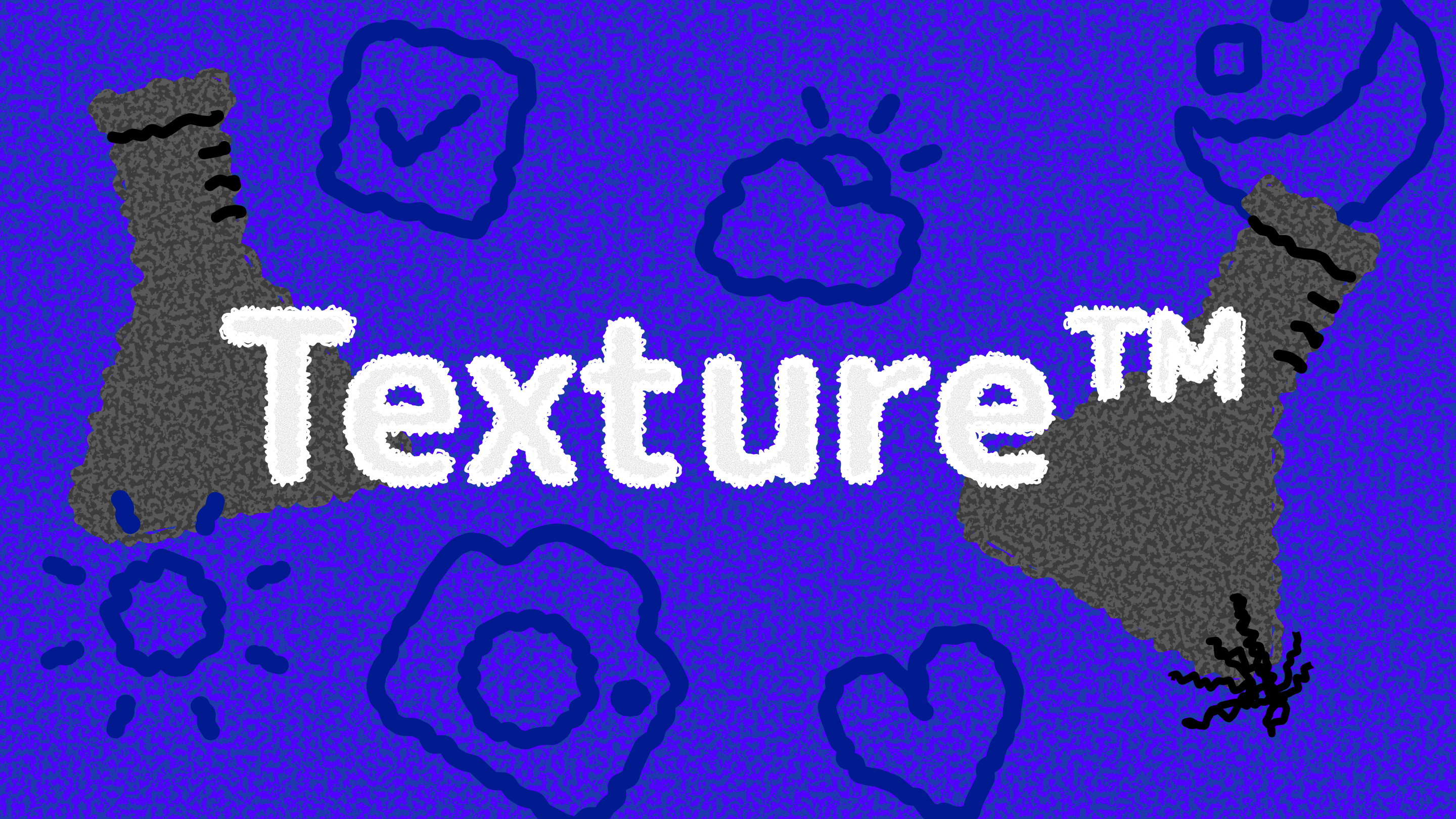
Why texture?
Interfaces have spent the last few years getting smoother, glossier and more weightless, and Apple’s Liquid Glass takes that about as far as it can go. I love how it looks, but I wanted to explore the opposite direction. What if a button felt like it had been scribbled onto a sheet of paper, rather than floating behind a pane of glass?
The aim isn’t nostalgia or a gimmick. It’s a fully working system, with proper states, light and dark themes and consistent spacing, that just happens to feel a bit more human. Imperfect edges make an interface feel approachable and a little playful, and they remind you that somebody actually made it.
Icons
The icons set the tone for everything else. Each one comes as an outline and as a filled version, and both are drawn with a slightly uneven line, as if inked with a marker. Scaled up, the rough edges really show, and the outlines on light paper switch naturally to the solid shapes on dark.
The full set covers what a typical app needs: navigation, media controls, sharing, editing, files and status. They all share one line weight and the same amount of wobble, so the roughness reads as a deliberate style rather than as inconsistency. Every icon has its filled counterpart for selected states and dark backgrounds.
Components
The core components each come in light and dark variants. The light theme sits on warm off-white paper, and the dark theme on near-black with a softer purple accent so it doesn’t glare. Page through to see buttons, toggles, text fields and list items side by side in both themes.
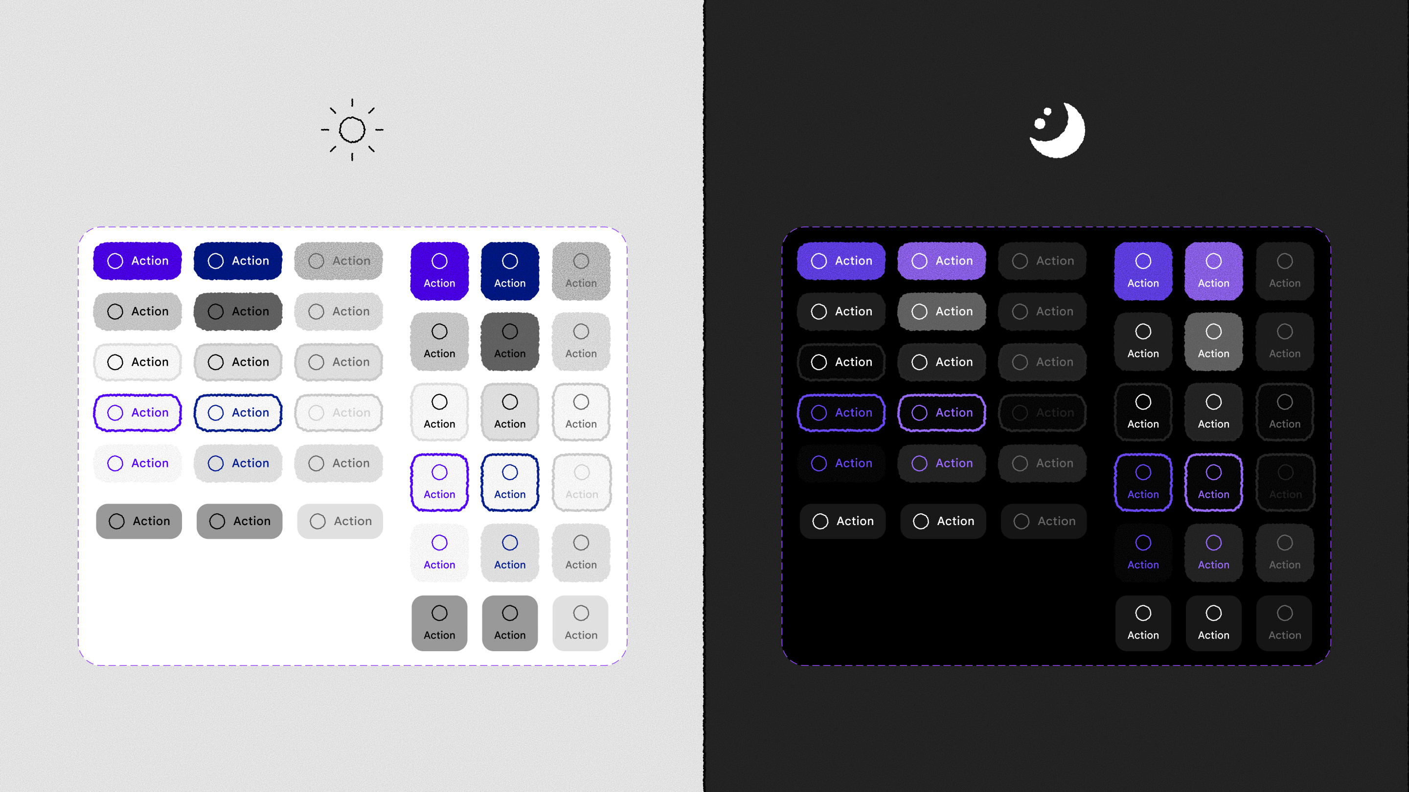
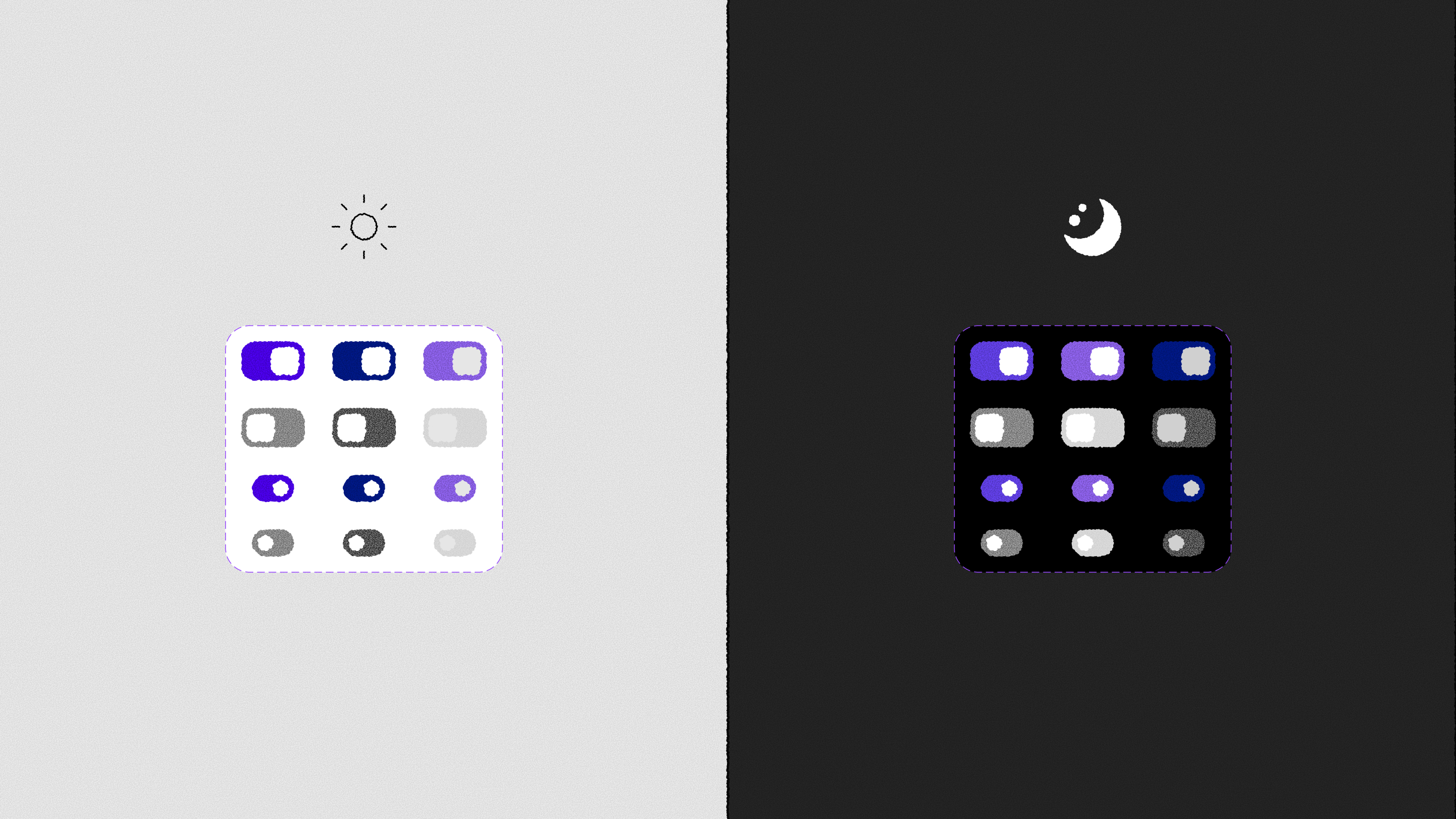
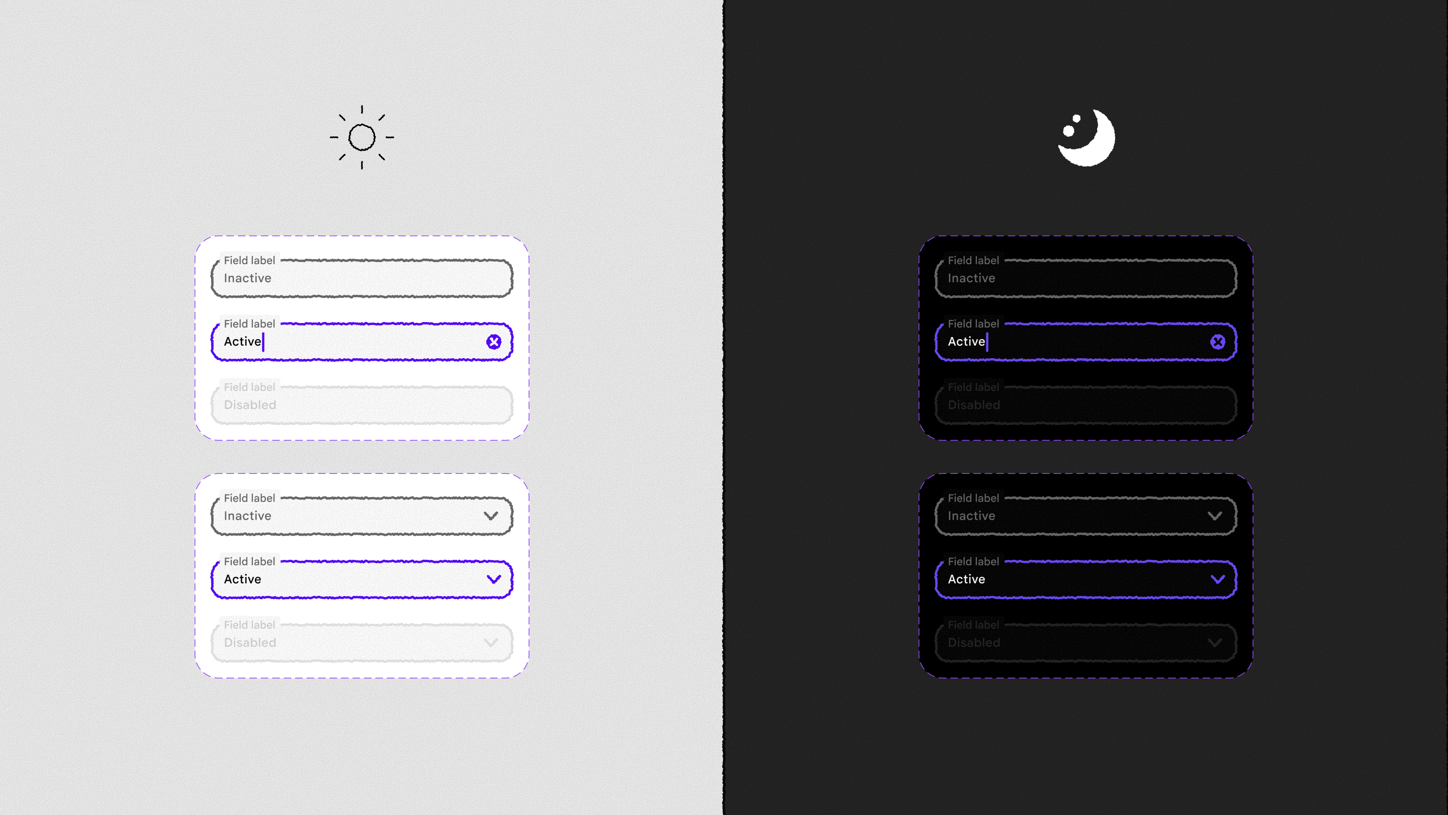
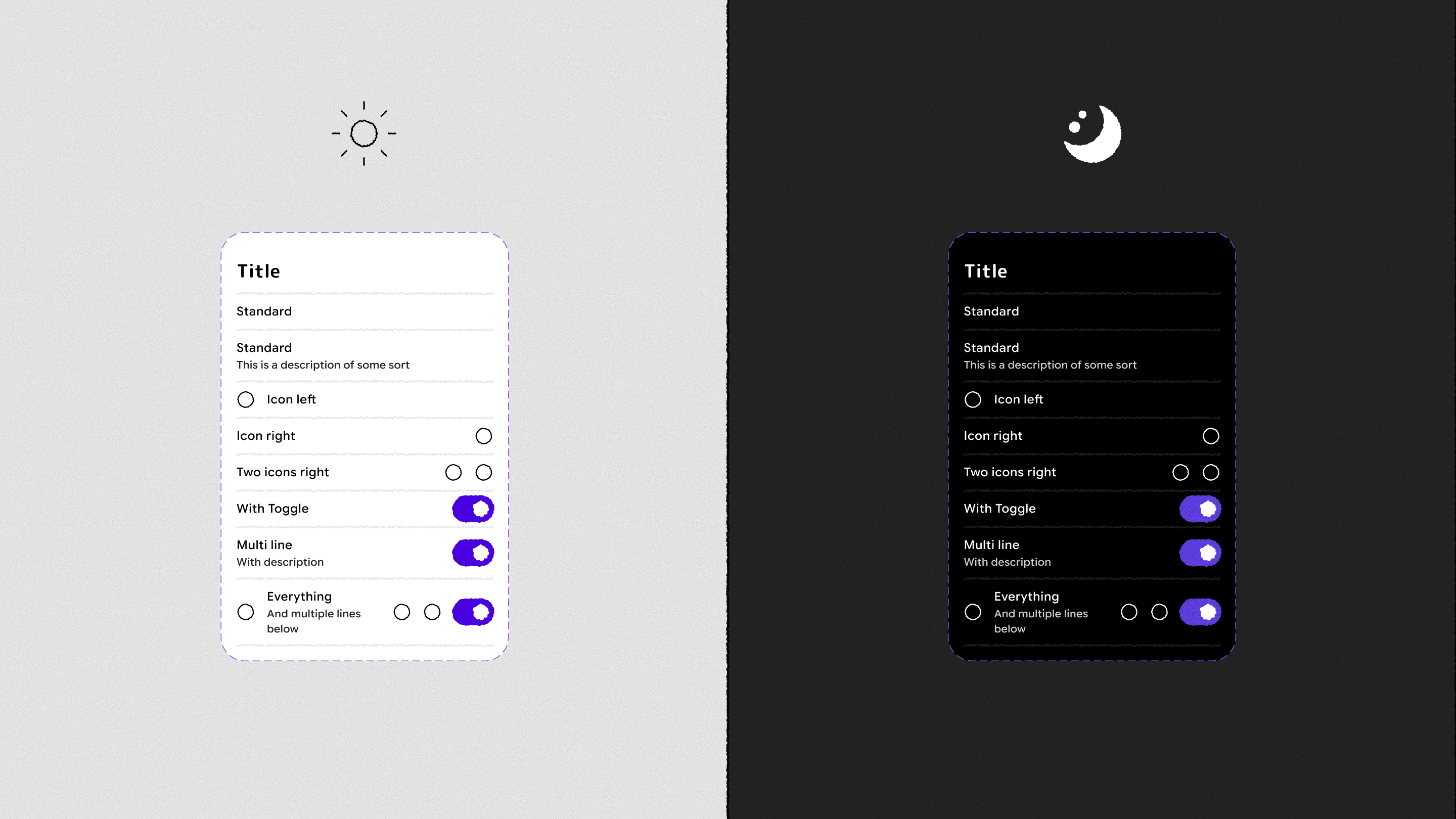
Buttons come in filled, tonal and outlined styles, in a horizontal layout for most actions and a stacked layout for compact toolbars, and every style has a faded disabled state. Text fields lean into the hand-drawn outline the most: the border thickens and turns purple when the field is active, a bit like going over a line again with a pen.
Putting components together
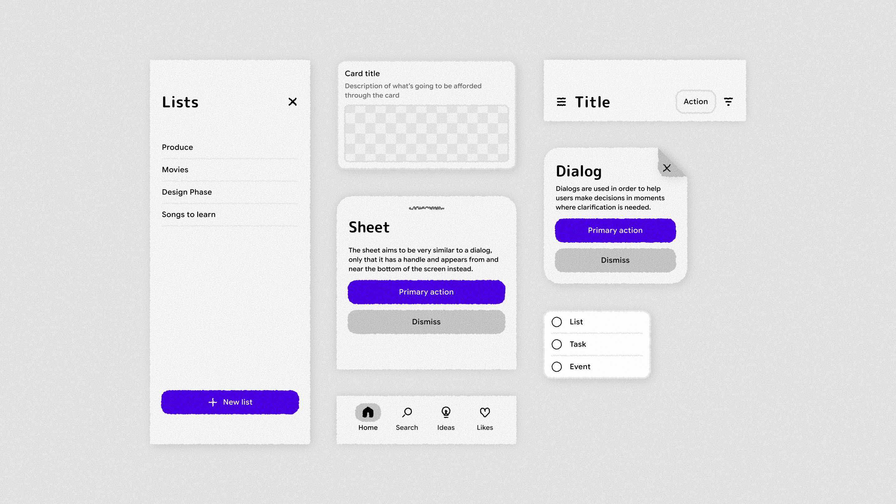
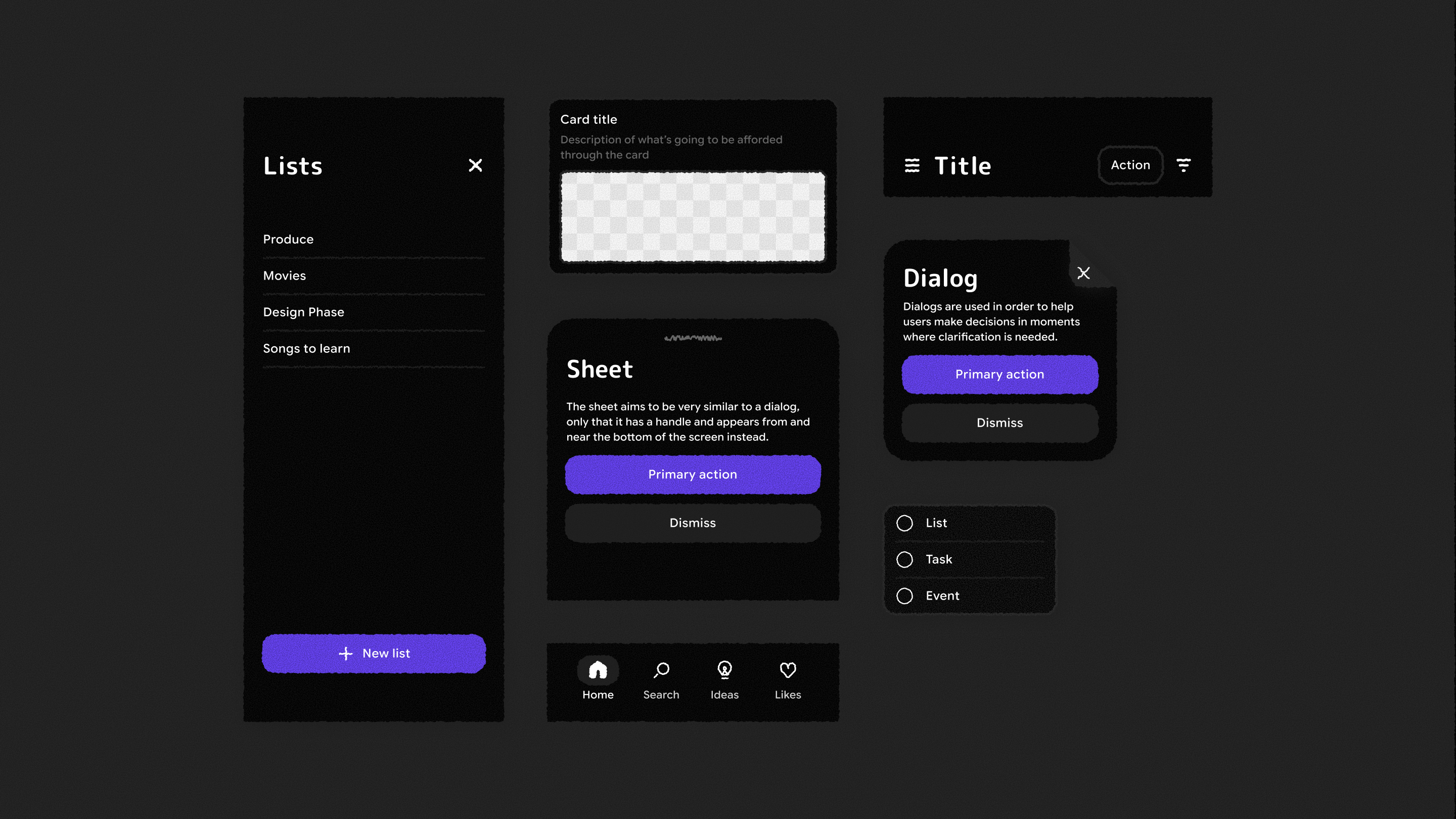
Combining those pieces gives the larger building blocks an app is made of: a navigation panel, cards, a bottom sheet, a dialog, a header bar, a menu and a tab bar. Every surface keeps the torn-paper edge, and the dialog has a folded-corner close button, a small detail that makes the paper metaphor feel literal.
In an app
To test the system, I designed a simple lists app with it. You can keep lists for groceries, films to watch or songs to learn, search across them, and add items from a bottom sheet. The screens below cover the main flows in both themes.
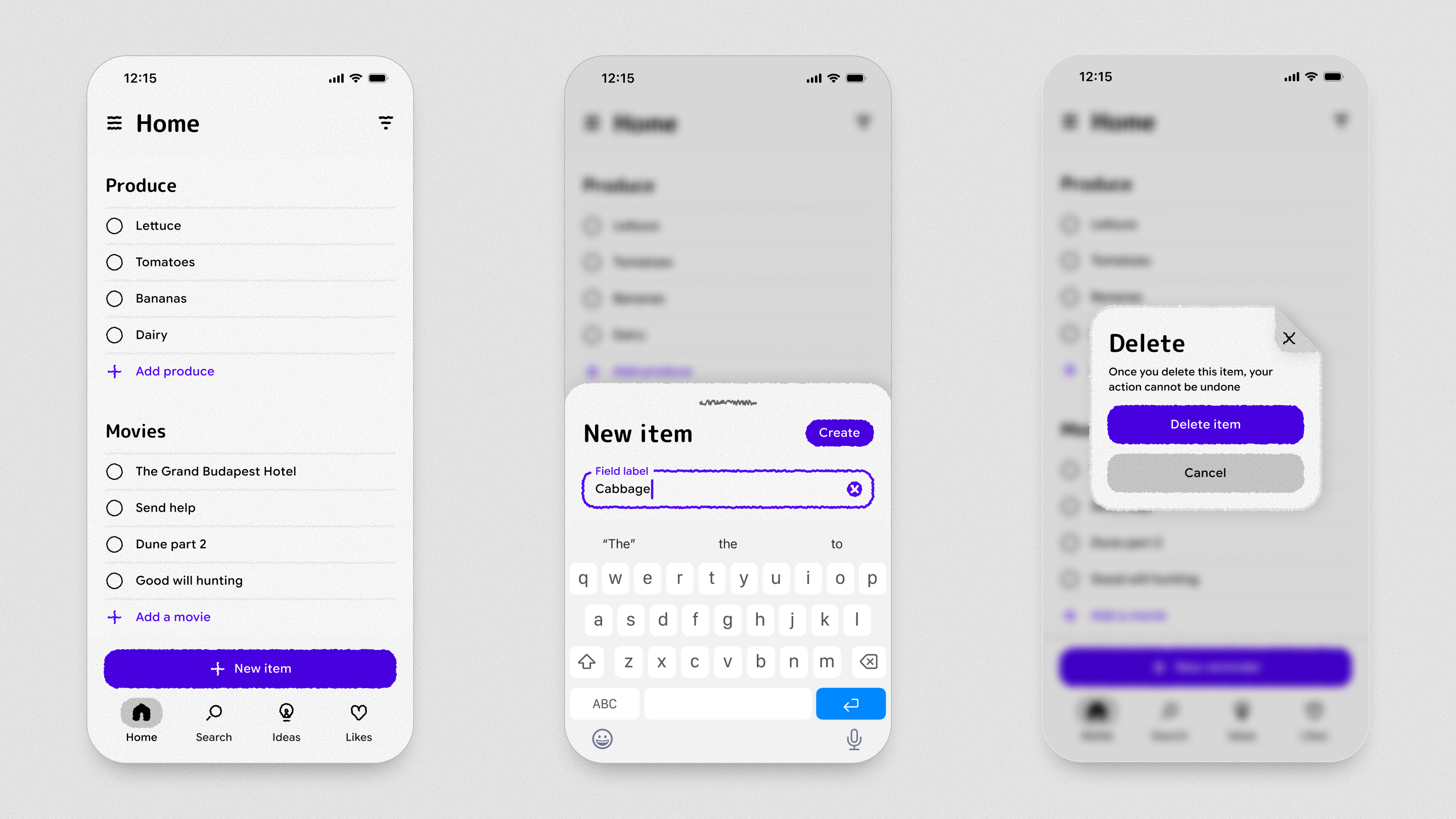
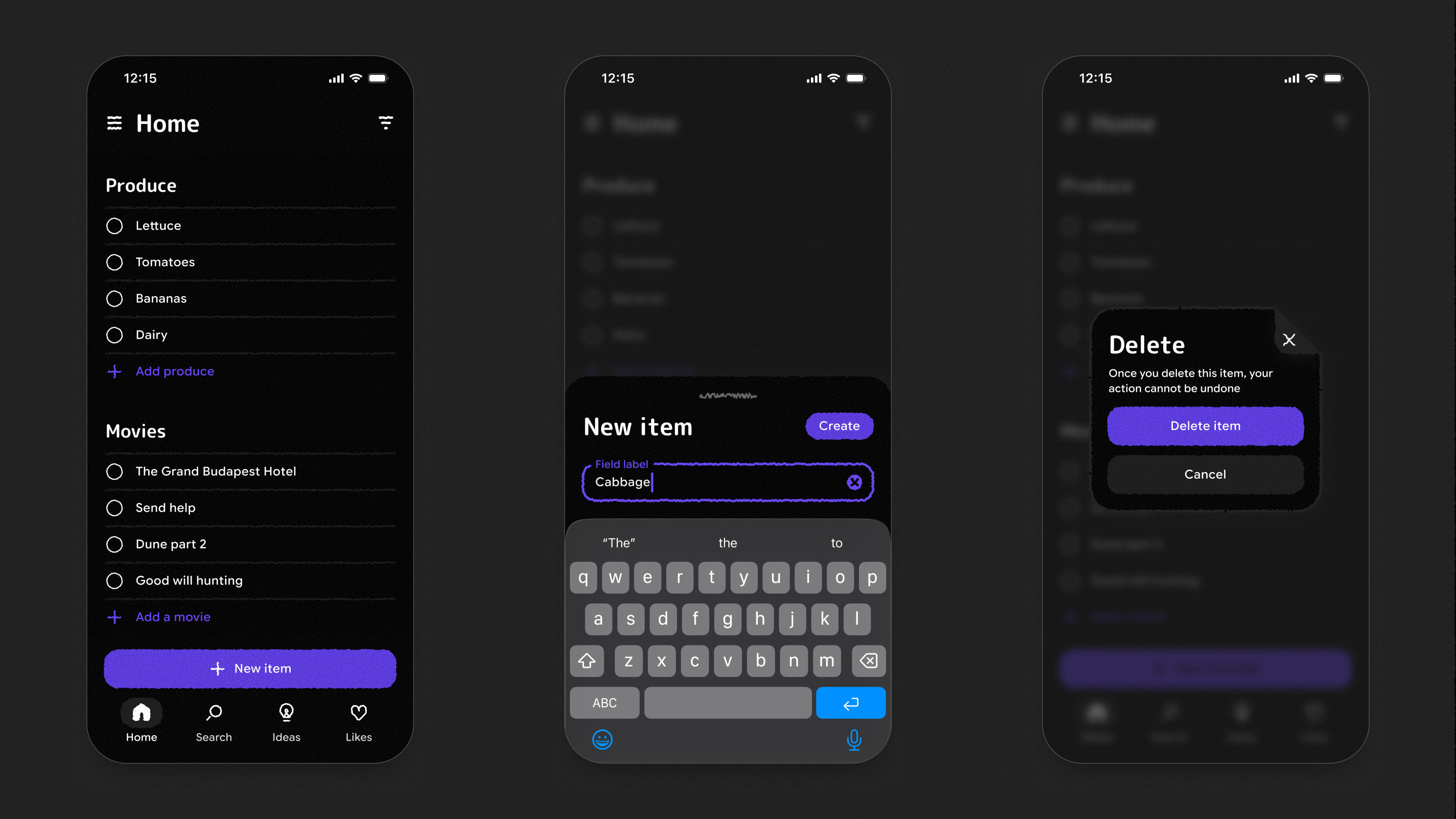
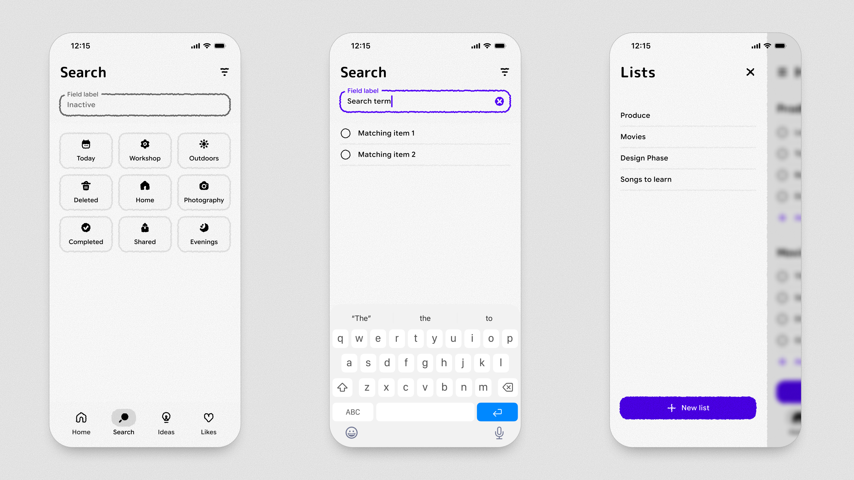
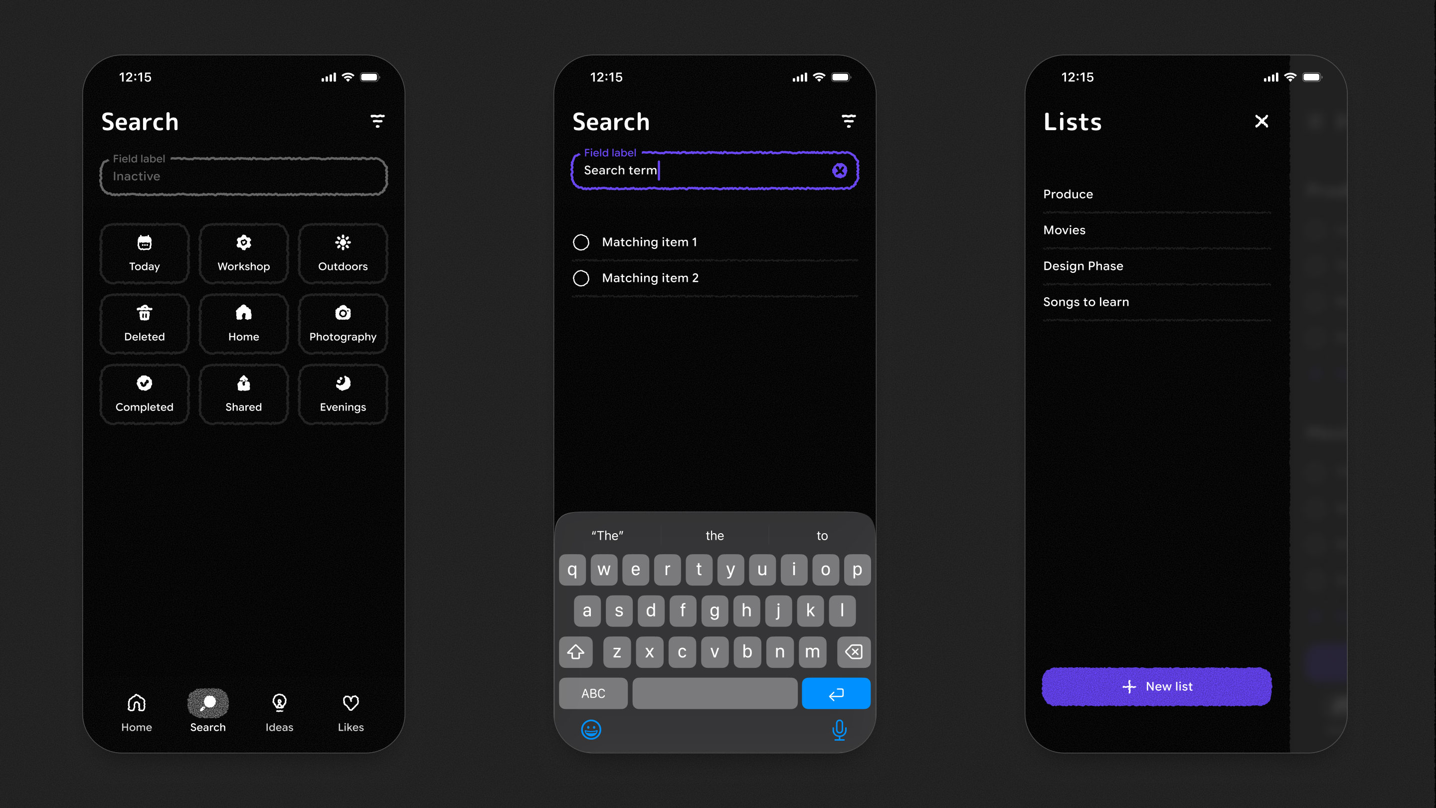
Seeing the components in a real layout was the best test of whether the idea holds up. The texture adds personality without getting in the way of the content, and the interface stays just as easy to scan as a flat one. Texture is still a work in progress, and next I’d like to bring it into code, where the edges can boil and shift as you interact with them. In the meantime, the full kit, including every component, the icons and these example app screens, is free on the Figma Community if you’d like to try it in your own work.